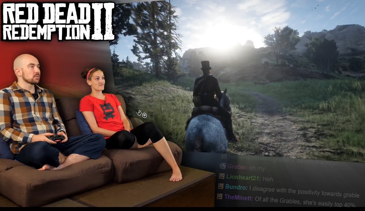
why isnt the normal black background like it was before… Now when there is day time or something bright on the screen it gets in the way of reading the chat
Fraser wanted to switch the chat to a dark mode; light mode also makes the lack of anti-aliasing in OBS’ compositing engine rather apparent. Might make the text a lighter gray though. Any suggestions for a colour code?
I dont have a suggestion for a color but any color is ok for me, I just think that the glare is in the way of reading the chat in some games.
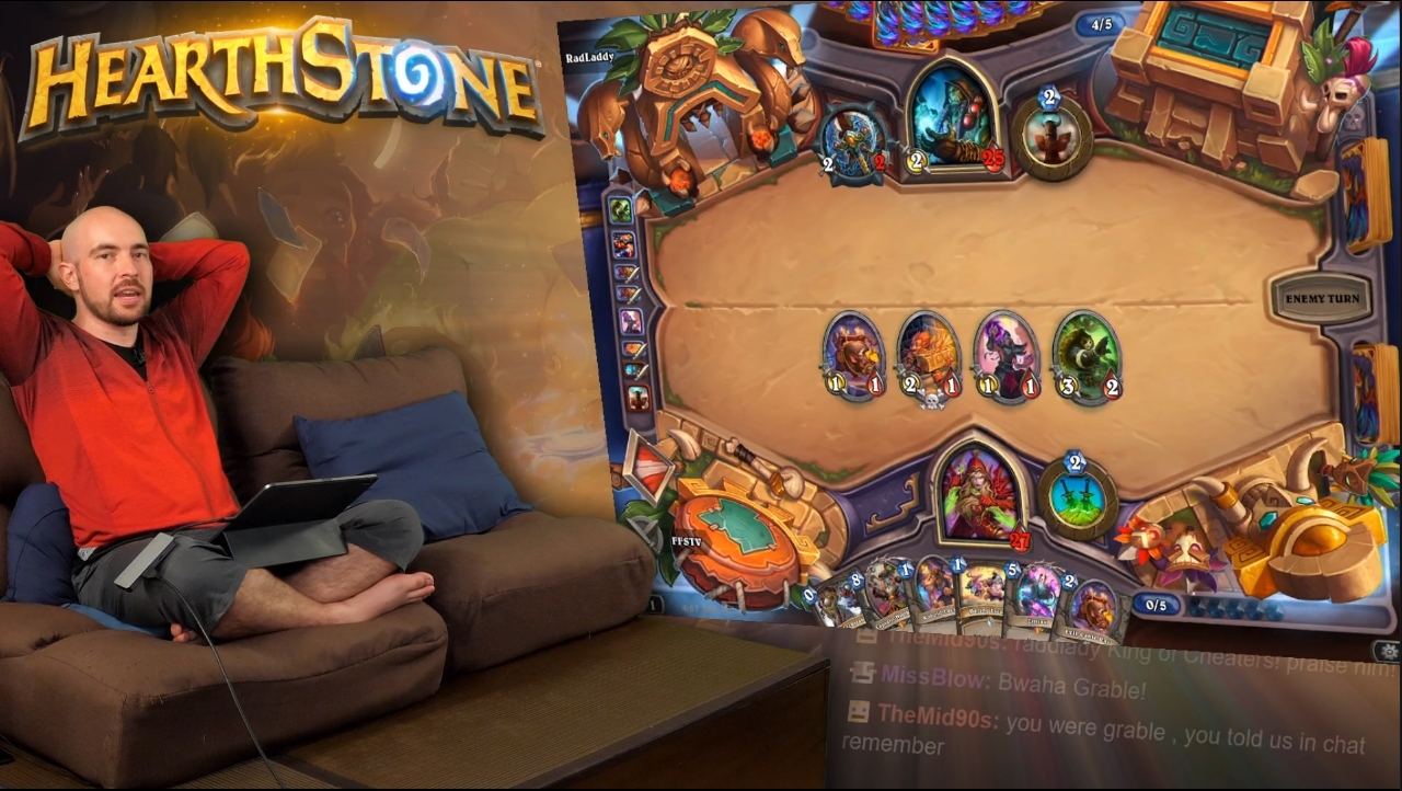
Another example
I am glad I am not the only one, I thought it might be the effects of getting older.
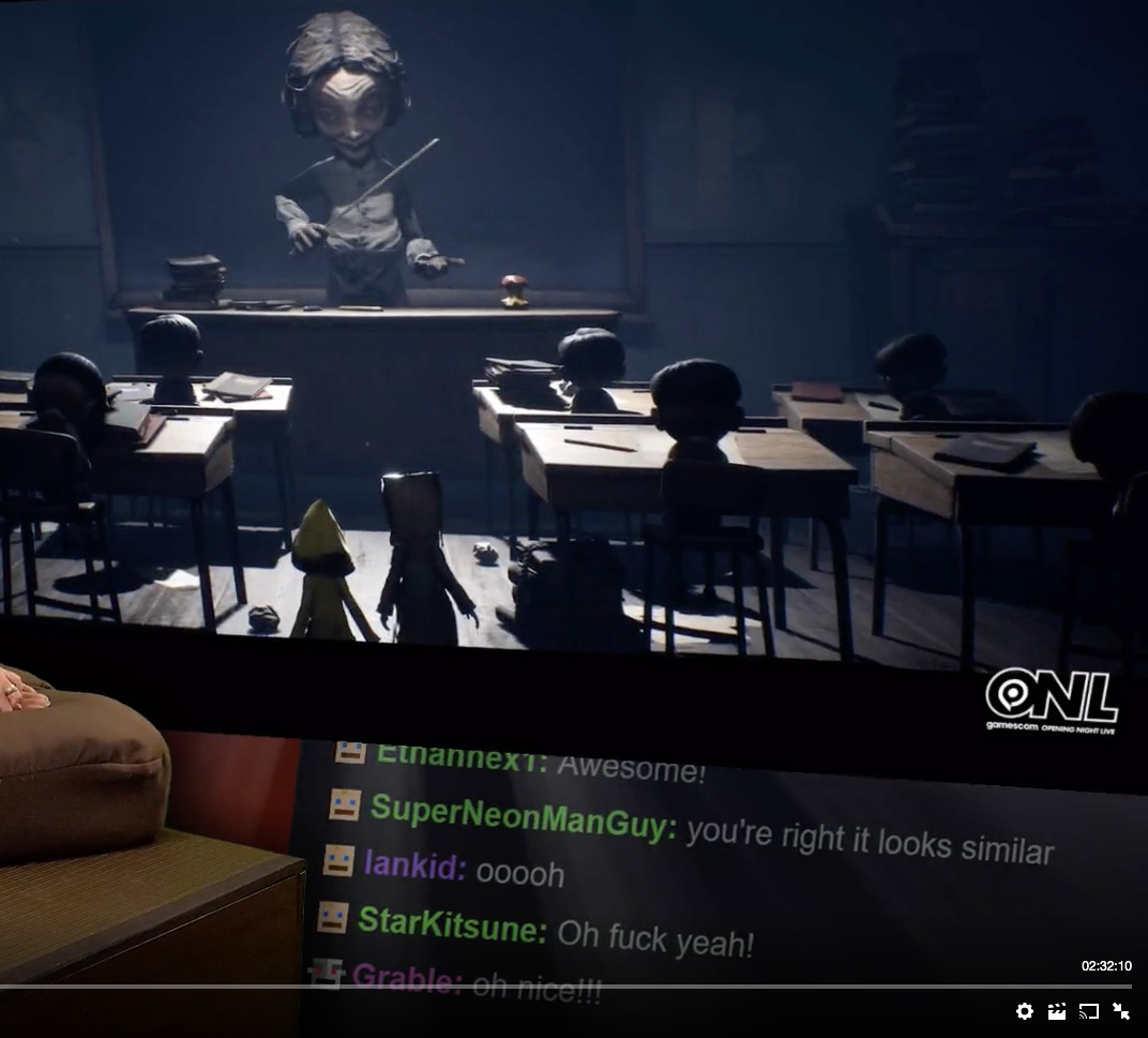
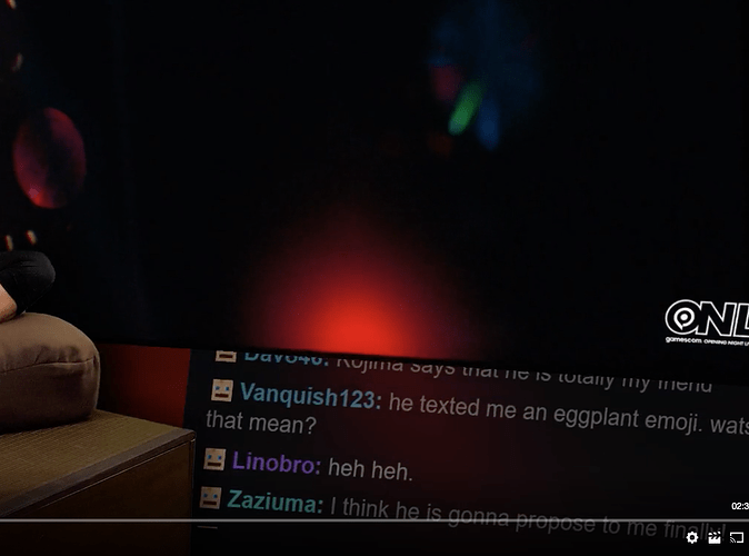
Screen shots from yesterdays gamescom show that shows the distracting glare, I personally for the most part thought it was not as bad in the last show but I know a lot of people find it very distracting and have a hard time reading the chat because of it
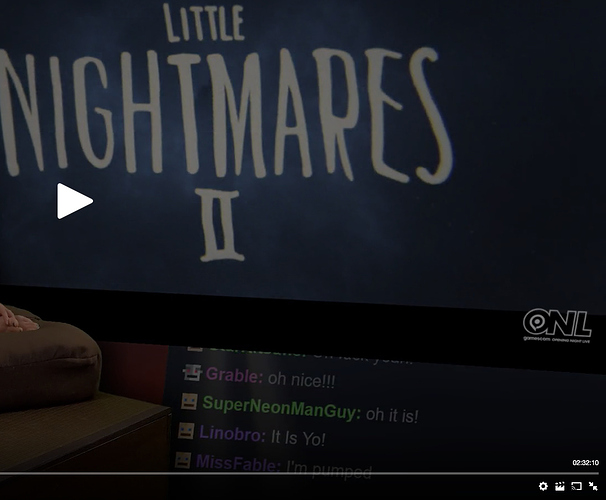
another screenshot from today’s stream
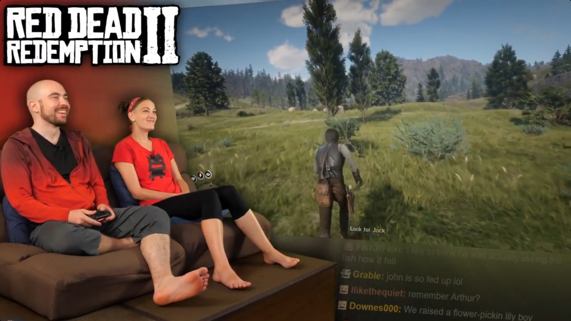
I wasn’t able to make this last show because of the 3am time they’ve been doing, but I saw this screenshot from the show and the chat is unreadable. does anyone know if it was like that the whole time? cuz i might just skip watching the vod if its that bad the whole show.
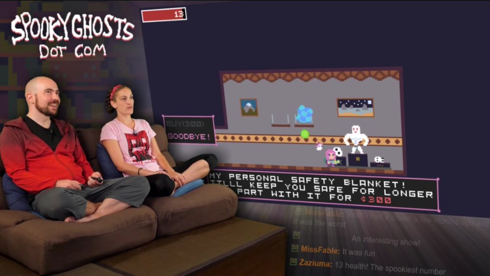
I can read the latest 3 lines just fine, the top being obscured by the glow. I honestly rarely read the chat anyway, and just glance at it randomly, so just reading the most recent ones is fine. Here’s what those said
“An interesting show!”
“It was fun”
“13 health! The spookiest number”
I like reading the chat when i watch the show
The glare was never an issue when the chat background was white cause you know, white glare on white text versus white glare on black text.
Just saying things before the dark mode change to chat was just fine.
